Posts
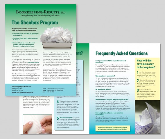
Brochure for Bookkeeping-Results, LLC
/in Portfolio item/by Anne SwansonClient: Bookkeeping-Results, LLC
Format: 11″x 17″, folds to 8 1/2″ x 11″
4-page brochure printed in full color
Design Objective: This brochure was designed to elicit interest in a new program for individuals or small businesses who need help staying organized and on top of financial paperwork.
Color Choice
/in Designer’s Eye/by Anne Swanson
Designer’s Eye is a series of articles in which I offer a graphic designer’s view of the world.
Online Tools Help You Decide
Sometimes it’s hard to imagine how colors might look together. The difficulty crops up when it’s time to design a website or printed piece, or even when you’re trying to put together a theme for a room in your home. I’ve discovered several online Read more
Postcard for PIGC Executive Luncheon
/in Portfolio item/by Anne Swanson
Client: Printing Industries of the Gulf Coast
Format: 5.5″ x 10.5″ full color postcard, printed on two sides that folds out to 5.5″ x 14.5″
Design Objective: Printing Industries of the Gulf Coast presents an educational program to its membership at the Executive Luncheon and Annual Meeting. Because custom bandage stickers were cost prohibitive, we created the illusion of a bandage closure with the overlap. A clear seal was placed in the middle of the overlapping flap in accordance with postal regulations.
Sherwin-Williams Commercials
/in Designer’s Eye/by Anne Swanson
Designer’s Eye is a series of articles in which I offer a graphic designer’s view of the world.
The Birds and the Bees
This series of commercials was created for Sherwin-Williams paint store by the animators at Buck. They used paint swatches to create a fantastic world full of magic and color. I was impressed by the creativity Read more


